 Brought to you by GHRT and The Coalition for Goblin Prosperity...
Wednesday, April 27, 2011
2D Design, verse 14
Poster for a Cause
 Brought to you by GHRT and The Coalition for Goblin Prosperity...
Brought to you by GHRT and The Coalition for Goblin Prosperity...
Thursday, April 21, 2011

Wednesday, April 13, 2011

Wednesday, March 30, 2011


Tuesday, March 29, 2011


Sunday, March 20, 2011
2D Design, verse 8
Line -- Digital Media
Moods in Dry Media -- For this exercise I used 1px pencil for Sadness and Frustration and 15px charcoal for Joy and Anger.

Movement in Wet Media -- For this exercise I used 13px soft round brush for Sleep and Sing and 25px large texture stroke brush for Crawl and Wash.


Moods in Dry Media -- For this exercise I used 1px pencil for Sadness and Frustration and 15px charcoal for Joy and Anger.

Movement in Wet Media -- For this exercise I used 13px soft round brush for Sleep and Sing and 25px large texture stroke brush for Crawl and Wash.


Wednesday, March 9, 2011
2D Design, verse 7 -- Midterm

Two-Dimensional Design Midterm
I chose this particular picture partially because most new pictures of me are profile shot while I’m driving taken by my girlfriend and partially because I like the profile look… when it comes to my pictures that is, lol. In all seriousness though, this picture epitomizes my character, particularly in the summer. Hair pulled back, shades on, just driving. I tend to always be on the move, or at least doing something. I can’t ever just be stationary with nothing to do. Even if I’m just sitting hanging out I have to be doing, going, even if it’s only in my mind. Which sounds kind of creepy, really. But I digress.
There really isn’t much about this picture that I don’t like or that doesn’t really scream “hey look, this is Kristofer!!!” The seatbelt cover in the upper part of the image is kind of off and looks odd the way it blends into my hair, but whether I like it or not, it’s another example of continuation which we learn about earlier this semester. And there are various unruly strands of hair, but I can’t complain too much about those for a couple of reasons: one, while I take a bit of pride in my appearance, I’m from the hair-metal era and in a band myself (although it is temporarily defunct), so the slightly disheveled look isn’t far off; and two, it being summer is the image, the window is down and I can feel the air running its fingers through my hair and across my face which I think is one of the best feelings that can be discussed in a public forum.
So there you have my little dissertation on me and my headshot. Enjoy!
Thursday, March 3, 2011
2D Design, verse 6


Tuesday, February 22, 2011


Thursday, February 17, 2011
2D Design, verse 4
"Frog Collage"

No it's not really a frog lol. My nickname for my son, Conner :) I started out building a collage of all my friends and family but this picture caught my eye and well... there's my theme!
Tuesday, February 15, 2011
2D Design, Verse 3
Focal Point


- Contrast
- I chose this image for contrast because although the woman is not in the center of the image, the purples draw the eye away from the greens of the rest of the image.
- Unknown artist and origin.

- Isolation
- I chose this image for isolation because the solitary figure in the chair draws the attention from the rest of the image.
- Found at digital-wallpapers.com.
- Unknown artist.

- Placement
- While the dragons surrounding the celtic knot are more colorful, they still only serve as a border and the attention is drawn to the intricacies of the knot itself.
- Unknown artist and origin.

- One element
- The attention is drawn to the firey fissure rather than the planet itself, emphasizing focus on one element rather than the whole image.
- Found at wallpaperswide.com.
- Unknown artist.

- Absence of focal point
- As you can see there really is not much of a focal point in this abstract image. The eyes are drawn to all parts of the image as a whole rather than one part.
- Found at nativebodypainting2011.blogspot.com.
- Unknown artist.

Monday, January 31, 2011
2D Design, Verse 2
Unity


- Proximity
- I took this picture last year at Rutland's Loyalty Day Parade (whatever that means). I chose it for proximity because of the unity in the center of the picture with the large group of students. Notice the ones not bunched together, in particular the girl on the far left, does not seem to be part of the whole and stands out whereas the rest seem to belong together.

- Repetition (emphasis on similarity)
- I found this image in my personal files. Where it came from I don't remember. The image of the dragon has been duplicated and mirrored giving the image unity and balance.

- Repetition (emphasis on variety)
- This picture was also in my personal files. Don't remember where I found it originally, but I liked it and though it seems to fit the bill for both variety and similarity, I'm using it for variety. The skulls are are roughly the same size, shape and color, yet are also each distinctly different in expression and positioning. I could have also used this for proximity I suppose, but that would have been cheating :D

- Continuation
- This picture was taken by my girlfriend on our way back from Missouri earlier this year. I chose it for Continuation due to the way the lines on the road merge in the distance and become a continuation of that part of the horizon, and at the same time, the far left and right lines seem to want to continue into the mountain and tree lines.

- The grid as organizing factor
- This is another image that I don't remember where I found it or who the artist is. Although the grid is appears to be 1x3 at first glance, there is technically another row at the top of the image depicting the symbols of the zodiac, topping the "panes" if you will, each of which depicts a period of the life cycle.

- An example of a chaotic, unreadable image
- I found this image at layoutsparks.com (amazing I actually know where one came from!) and while it isn't totally unreadable, it's difficult to read due to the sheer number of subjects all thrown together in one image.

- An example of a non-objective expression of unity
- Yet another image without known origin (see a pattern? lol). I see a non-objective unity in this image due to the analogous color scheme, with a warm range of oranges and golds which ties the dragon and pentagram together better. Were the dragon or background non-analogous it would still be a cool image, but not quite as unified.

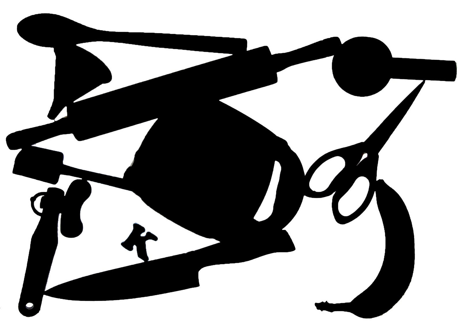
- An example of a figurative expression of unity
- I was sent this image in email a few years ago as a brain teaser of sorts. Although everything seems disjointed and chaotic, the individual parts of the image are all band names. I don't remember how many there are but it's a lot lol.

Friday, January 28, 2011
2D Design, Verse 1
Well here's my first post... it's not much and I'm not good at posting so bear with me lol.
An image that represents my ideal in 2D Design... not entirely sure what that means, but I'm probably over-thinking it lol. So this is what I came up with...

An image that represents my ideal in 2D Design... not entirely sure what that means, but I'm probably over-thinking it lol. So this is what I came up with...

Subscribe to:
Posts (Atom)