Tuesday, March 29, 2011

Sunday, March 20, 2011

2D Design, verse 8

Line -- Digital Media

Moods in Dry Media -- For this exercise I used 1px pencil for Sadness and Frustration and 15px charcoal for Joy and Anger.


Movement in Wet Media -- For this exercise I used 13px soft round brush for Sleep and Sing and 25px large texture stroke brush for Crawl and Wash.

Wednesday, March 9, 2011

2D Design, verse 7 -- Midterm

Two-Dimensional Design Midterm

I chose this particular picture partially because most new pictures of me are profile shot while I’m driving taken by my girlfriend and partially because I like the profile look… when it comes to my pictures that is, lol. In all seriousness though, this picture epitomizes my character, particularly in the summer. Hair pulled back, shades on, just driving. I tend to always be on the move, or at least doing something. I can’t ever just be stationary with nothing to do. Even if I’m just sitting hanging out I have to be doing, going, even if it’s only in my mind. Which sounds kind of creepy, really. But I digress.

There really isn’t much about this picture that I don’t like or that doesn’t really scream “hey look, this is Kristofer!!!” The seatbelt cover in the upper part of the image is kind of off and looks odd the way it blends into my hair, but whether I like it or not, it’s another example of continuation which we learn about earlier this semester. And there are various unruly strands of hair, but I can’t complain too much about those for a couple of reasons: one, while I take a bit of pride in my appearance, I’m from the hair-metal era and in a band myself (although it is temporarily defunct), so the slightly disheveled look isn’t far off; and two, it being summer is the image, the window is down and I can feel the air running its fingers through my hair and across my face which I think is one of the best feelings that can be discussed in a public forum.

So there you have my little dissertation on me and my headshot. Enjoy!

Thursday, March 3, 2011

2D Design, verse 6


Rhythm

I chose taste for my sense and used bland, spicy, sweet and sour for the aspects of taste.


And my fifth design is a representation of taste and the tongue.


Tuesday, February 22, 2011

2D Design, verse 5

Balance

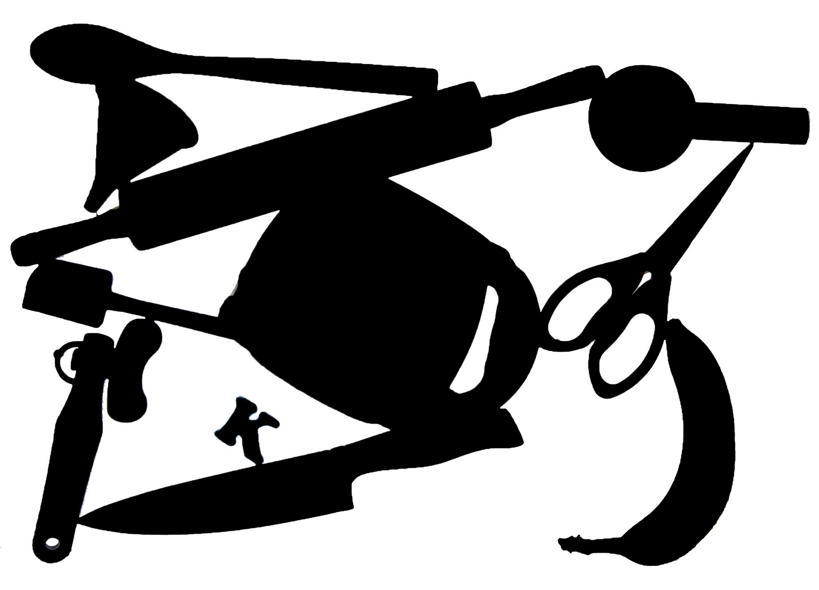
Positive Silhouette


Negative Silhouette


Revamped Silhouette


Thursday, February 17, 2011

2D Design, verse 4

"Frog Collage"


No it's not really a frog lol. My nickname for my son, Conner :) I started out building a collage of all my friends and family but this picture caught my eye and well... there's my theme!

Tuesday, February 15, 2011

2D Design, Verse 3

Focal Point

  • Contrast
    • I chose this image for contrast because although the woman is not in the center of the image, the purples draw the eye away from the greens of the rest of the image.
    • Unknown artist and origin.


  • Isolation
    • I chose this image for isolation because the solitary figure in the chair draws the attention from the rest of the image.
    • Found at digital-wallpapers.com.
    • Unknown artist.


  • Placement
    • While the dragons surrounding the celtic knot are more colorful, they still only serve as a border and the attention is drawn to the intricacies of the knot itself.
    • Unknown artist and origin.


  • One element
    • The attention is drawn to the firey fissure rather than the planet itself, emphasizing focus on one element rather than the whole image.
    • Found at wallpaperswide.com.
    • Unknown artist.


  • Absence of focal point
    • As you can see there really is not much of a focal point in this abstract image. The eyes are drawn to all parts of the image as a whole rather than one part.
    • Found at nativebodypainting2011.blogspot.com.
    • Unknown artist.